I grew up in the West Midlands and attended Walsall College of Art for a general foundation in art and design at age sixteen. After that, I applied to St. Martin’s School of Art (now Central Saint Martin’s - University of the Arts London). I was mainly inspired by looking at copies of The Face magazine that our graphic design tutor used to bring in and by thoughts of escaping to trendy London.
The great thing about St. Martin’s was (and maybe still is?) that they allowed you to ignore the course work if you thought you had better ideas. This is exactly what I did as soon as I realised it was not only allowed but encouraged. My favorite day at college was when five shiny new Apple Mac Classics suddenly appeared in what was swiftly rechristened ‘the computer room’. This was back in 1985, so it was a big deal. There were no tutorials or lectures. Being St. Martin’s, they just left them plugged in and let us get on with it.
At our degree show, Creative Review magazine invited Neville Brody to review our student work for a feature article in his capacity as design god de jour. He sweetly (but awkwardly) said ‘there’s only one worth mentioning, Jon Crossland.’ So I got an entire article to myself and my first job out of college as his assistant. (At this point, I'd link to the article online, but I haven't got a subscription...)
Back then, Neville’s studio was above Burger King on Tottenham Court Road. And 21-year-old me had a blast working there (and blagging into clubs and parties) at all hours.
I worked a few jobs in London (Nexus Design, The Body Shop, Bill Smith Design) before trying my hand at the Designer’s Republic in Sheffield.
Then it was back to London as a freelancer and the start of a 10-year working relationship with Storm Thorgerson with whom I created ‘Floyd stuff’ and other projects for bands that had grown up admiring his old Hipgnosis covers. Storm was a valued mentor and great friend, sadly missed.
In 2000, I got a free two-week trip to California, flying over to help a friend of Storm’s design a new identity for his bespoke coffee company. Being English and unused to the sun, I loved it and decided to stay. I worked for a few agencies in Sacramento and, plot twist, bought a dog grooming shop in Del Paso Heights (Sacramento’s ‘hood’) which was fun for a while. Then, after a spell in Dallas, TX, I moved back to London — a less cow-based economy — in 2016. I've worked since then for a fashion/PR company, continuing to freelance on the side and do my own stuff.
[Back]
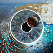
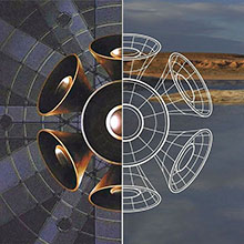
The usual approach to designing Pink Floyd covers was: bring the team together and churn out drawings until there was enough material for Storm to bombard the band into submission. I drew the eye design while hiding in another room trying to avoid the exhausting draw-a-thon - really just a doodle of an eye surrounded by symbols redolent of gnosis and alchemy that intrigued me at the time. But the band liked the idea (or Storm liked it sufficiently to persuade them).
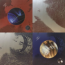
Production of the finished image involved numerous bike rides to photo libraries (physical buildings in those days) and rented time on a scarily big computer to put the transparencies together as a photographic version of my drawing.
For the four-disc box set inner sleeves, I used an 1980s-vintage technique involving degraded photocopies, moved around while the copier scanned, to create abstract images. (Note to self: bring this back, it's a lot of fun...)
[Back]
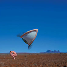
While pitching for this job, it became clear that Storm was only going to give me the design gig if I ‘modelled’ as well, thus boosting our budget by not having to pay for a proper one. The remainder of the production money went on having a large plastic eye made (though only half the size of how it appears in the final image) and a trip to Monument Valley to photograph it. Going the extra mile (or 5,000 of them) to shoot on location guaranteed that the lighting and ambiance of the subject remained consistent with the background and not obviously photoshopped.
I’m sure Storm would be as amused as I am that our left-field piece of modern surrealism was nominated by Pitchfork as the worst album cover of all time. I consider it an accolade.
[Back]
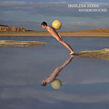
Happy memories of breakfasts at Denny’s and trying to buy beer in the middle of Mormon country... Another design gig for Storm that required me to ‘model’. This job involved an 8-hour Greyhound bus trip out to Utah from Sacramento, where I was living at the time, after Storm refused to pay for a flight. The cover shot was achieved by dangling me at an otherwise unfeasible angle over a freezing cold lake at 5am and erasing the guy holding the rope afterwards. [Back]
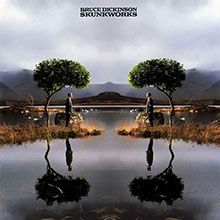
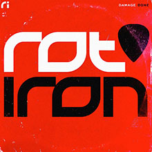
This album by Iron Maiden’s Bruce Dickinson was all about psy-ops and mind control. I came up with a sketch of two guys communicating telepathically via brain-shaped trees. In line with Storm’s traditional M.O., we then had full-size plastic trees made and the shot was taken on a drizzly loch in Scotland.
I was a bit obsessed with the authoritarian/fascist undertones of symmetry at the time, seemed appropriate for a project about sneaky big government manipulation. The single image was repeated and flipped in the final design so the guy was facing a clone of himself. Storm did insist on putting some weeds and other details in assymetrically to 'naturalize' the image a bit.
[Back]
We pursued a trash/pop art direction for this neo-punk rock band. I designed a bingo style layout featuring visual puns relating to life - we had fun thinking them up and shooting them in the studio. Life’s a bitch, Life’s a riot, Life sucks, Life is sacred, etc., etc.
At one point, we hired an animal guy with a chicken to photograph. I remember Storm getting exasperated with it refusing to stand still and asking the handler why it wasn't better trained. He replied with the immortal words "Have you ever tried training a chicken..?"
[Back]
For the first single from ‘Just Add Life’, I designed faux supermarket product packaging for the cover - cheap, bright and bold as a punk pastiche of 90s consumer culture. [Back]
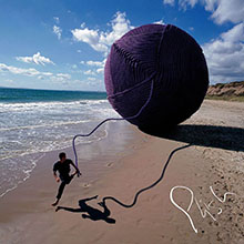
Phish were/are famous for their musical journeys of improvisation and introspection, an idea that conjured up images of unraveling balls of string and scrapbooks (why not?).
While Storm and Rupert were busy shooting a guy running about on a beach with a giant ball of yarn we had made, I set about designing the logo and packaging with a sketchbook feel and created the font from a scan of my handwriting (remember fontographer?) to fit with the mood.
[Back]
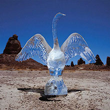
Discussing impermanence and the ephemeral nature of relationships, I suggested an ice swan in Death Valley. Must admit my primary motivation was getting a free trip to the location as I’d always been fascinated by the place. Luckily, Storm and the band were taken with the poignancy of the idea. Not so luckily, I didn’t get to attend the shoot. It was shot for real - a van-full of ice swan sculpures driven through the Mojave desert in a refrigerated van to meet their doom - did sound like a novel day out. [Back]
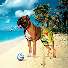
It was fun to work for Storm’s mate, Ian Dury. We came up with a cheeky idea that I did as a deliberately crude, paper-and-scissors type of collage in keeping with the crudity of the 'pants' double pun. The photography involved a run around Hampstead Heath with a borrowed boxer dog (wearing boxers of course). I then cut him out and added a travel brochure-style background. Couldn’t resist putting a sinking yacht in the background for added tragi-comic effect. The concept was carried through with collage illustrations on a dog theme for the CD lyric booklet. [Back]
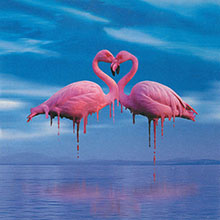
I was always a fan of those lurid 3D lenticular postcards - the type that usually featured vases of flowers, kittens or popes standing by waterfalls. I followed the aesthetic for this ironically kitsch romantic cover. I had a kind of Dali-esque vison of them melting while forming their necks into a heart-shape and spent many hours huddled over Photoshop messing about with a roll of flamingo pics Rupert shot at London Zoo. [Back]
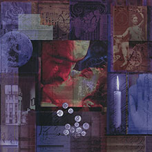
While suffering through my dull day job in Sacramento, California, I was asked by a friend to do an album cover for his band. I spent a good few weeks googling random images on the sly and building them into a giant collage symbolizing the American angst of that time, the post-9-11 Bush-era. Because I agreed to do the whole package for a case of beer, that meant I could do whatever I wanted and the client wasn't allowed to be fussy. In this case, what I wanted was to meld psychedelia, punk rock and americana using the collage style I’d been honing since college. [Back]
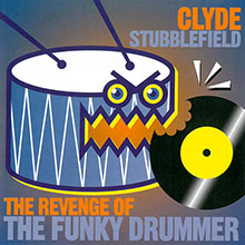
This was the cover I designed for an album by the late lamented Clyde Stubblefield, a.k.a. ‘The Funky Drummer’ of James Brown fame. A sort of proto-emoji sprang to mind (built in Freehand 3) showing an avenging snare drum biting back on 20-odd years of music, from Run DMC to George Michael, that had sampled his work. Or, in hip hop parlance, had 'bitten' his style. [Back]
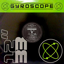
I used to do a load of quick label jobs for Black Market Records in London (until they bought their own Mac and decided to cut out the middle man). This one is from the early days of Freehand 3... a 90s tech logo and house bag design for their techno sub-label. [Back]
A favor for a friend. Sometimes, these are the best jobs as you can get to do exactly what you want as it’s not costing anyone money. Revisited my fresh-out-of-college gig as Neville Brody’s assistant, back in the days of hand drawn experimental typography. In this case, applied as a logo for a heavy metal band. Because... why not? [Back]
A rejected pitch for an ambient electronic album. Option 1 revisited spooky symmetry to create vaguely unsettling ambient images based on landscapes. Option 2 threw back to my distant college roots and memories of those super-cool, ‘interactive’ dye-cut album covers by designers like Malcolm Garrett and Peter Saville, plus a nod to the experimental typography of my first boss, Neville Brody. We used to draw that sort of thing with rotring pens and compasses back in the day... [Back]
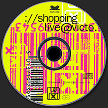
I did quite a few covers for ReR back in the days of floppy discs and Mac System 7. This one was a chunky pixels computer collage (that had to fit on a 1.4mb floppy) satirising consumer culture for an avant garde art music release of the same theme. It's so long ago, we were still enjoying the novelty of the 'at' sign and weren't really sure what it meant. [Back]

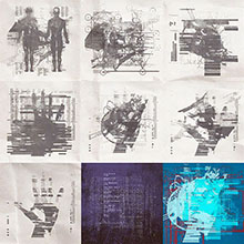
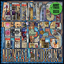
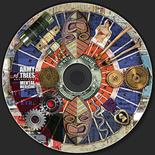
The Collective Noun is the cover name for my own art/music crossover project, ongoing since 2012. These are some of the digital collage covers and printed fold-outs to accompany the music. The band is imaginary, but the music is real. [Back]
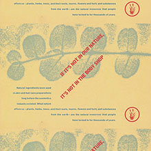
An early gig as senior designer for The Body Shop working at corporate HQ in London. I worked with founder and owner, Anita Roddick, to create something “a bit different” for their 1989 company report. It ended up as a stack of a5-size postcards with inspirational themes printed on recycled card with an accompanying book of boring numbers to fulfill its role as an actual company report. [Back]
Anita Roddick launched a campaign through her company to raise public awareness of the destruction of the Amazon rain forest. I guess they'd call it corporate activism tody. But, in 1989, it was unusual for a large company to get involved in real-life issues. I drew on my love of Russian Constructivism and Franklin Gothic to create the logo and posters. Very flattering that it ended up archived by the V&A and was featured in the exhibition A World To Win. [Back]
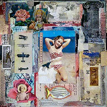
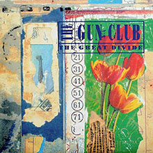
While at art school, I spent long periods of time prowling East End flea markets like an artsy Jack The Ripper finding stuff to use in collages. This was my favorite piece that grew organically from that habit over the years. I was eventually able to use it for a record cover when worked at Designer’s Republic. I enjoy the garish quality of old color copiers. They also gave you the freedom, pre-Photoshop, to reduce and enlarge separate elements easily. (Note: Soviet-era Tulip candy bar wrapper as a central element that I bought in Moscow, 1985. :) [Back]
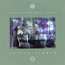
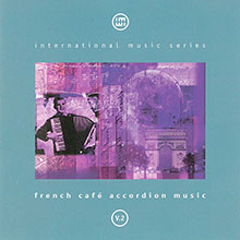
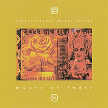
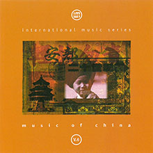
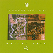
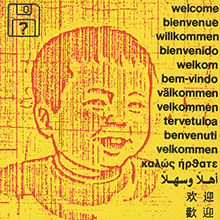
With Cooking Vinyl as a client, it wasn't all hip indie and hip hop record cover jobs. A bargain CD series of world music sold primarily in gas stations? Hey, why not... it was a great opportunity to do some nice design and illustration without anyone being particularly bothered about messing about with the art. [Back]
A personal art/poetry project taking advantage of the proliferation of affordable online self-publishing. Important Memos (For People Who Will Never Read Them) covered themes of illness, divorce, lost love... it was a rough year. [Back]
Storm was commissioned to do the Scottish Opera 1997 (I think) yearly programme. I got to contribute a collage illustration for La Boheme. Composed using black and white photocopies from the copier in Holloway Road library, back when libraries were the equivalent of Google images. The piece comprised various references to the plot of the opera and was scanned into my trusty Macintosh LC II for colorization and tweaking. [Back]
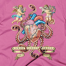
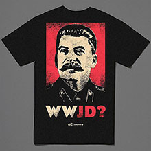
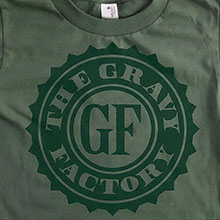
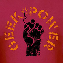
When I arrived back in the UK (penniless) after 15 years in the US, making money was a priority. We set up a Shopify t-shirt company and went for it. Unfortunately, I was unable to retire to Antigua on the proceeds, but I designed a few neat shirts. [Back]
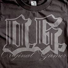

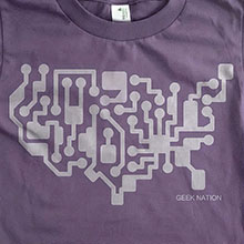
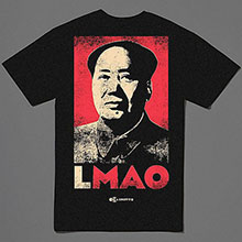
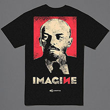
Back in 2004, an ad guy friend in Sacramento drafted me in as the design guy for the t-shirt/apparel company he was starting. Churned out many designs and even got quite a bit of press coverage (including a weird interview on local news). The company is currently on ‘extended hiatus’... [Back]
